

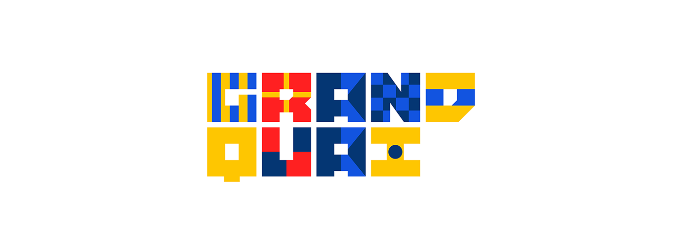
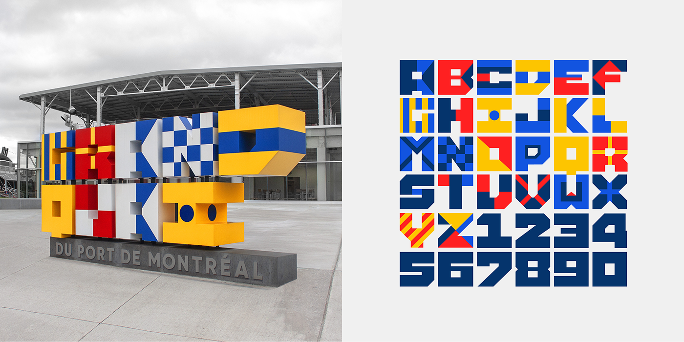
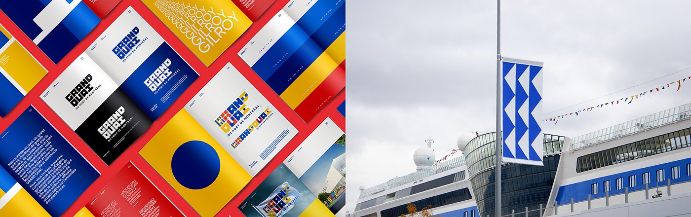
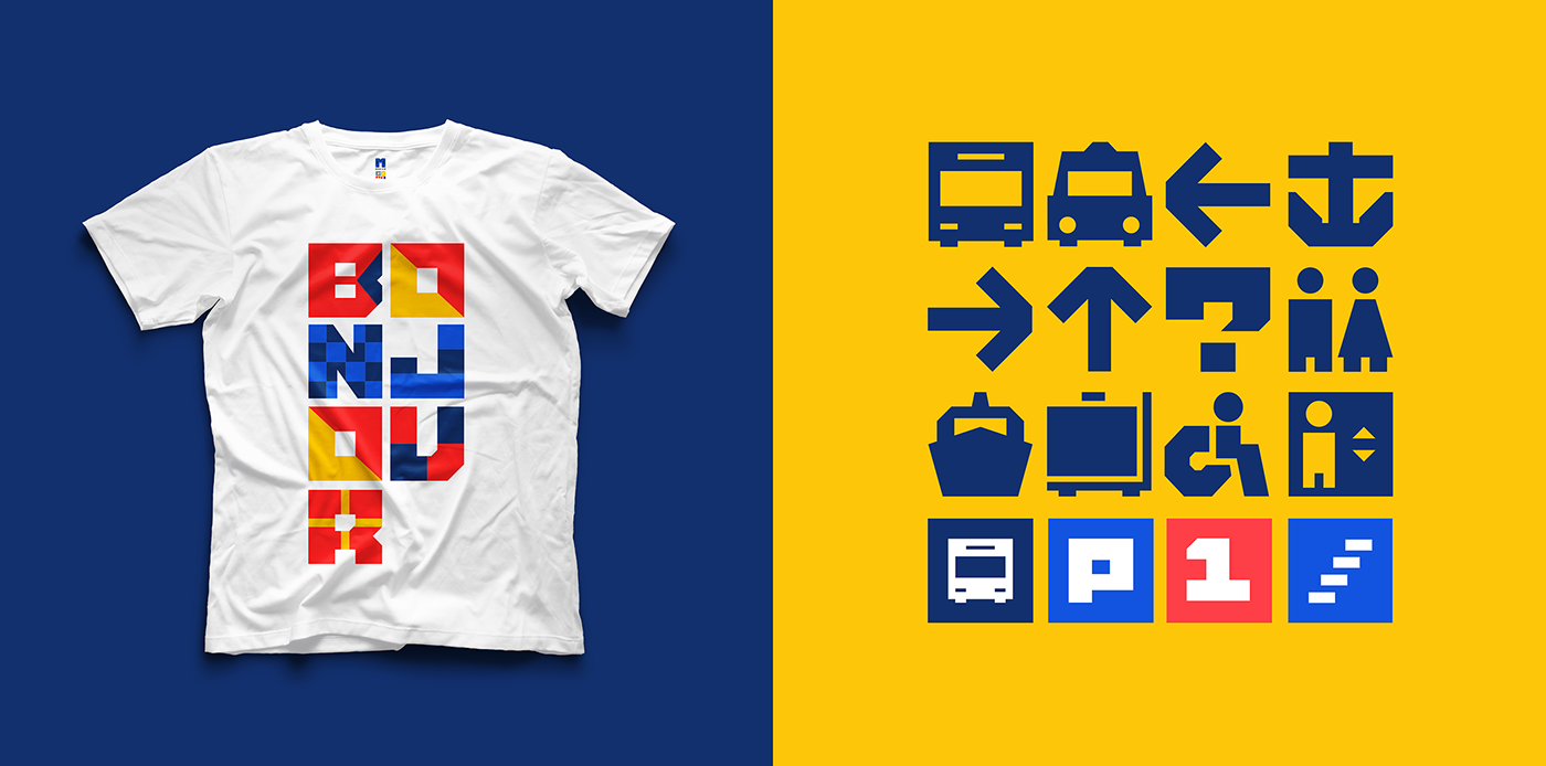
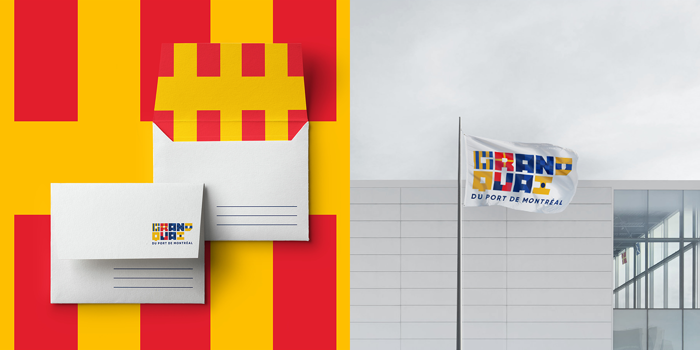
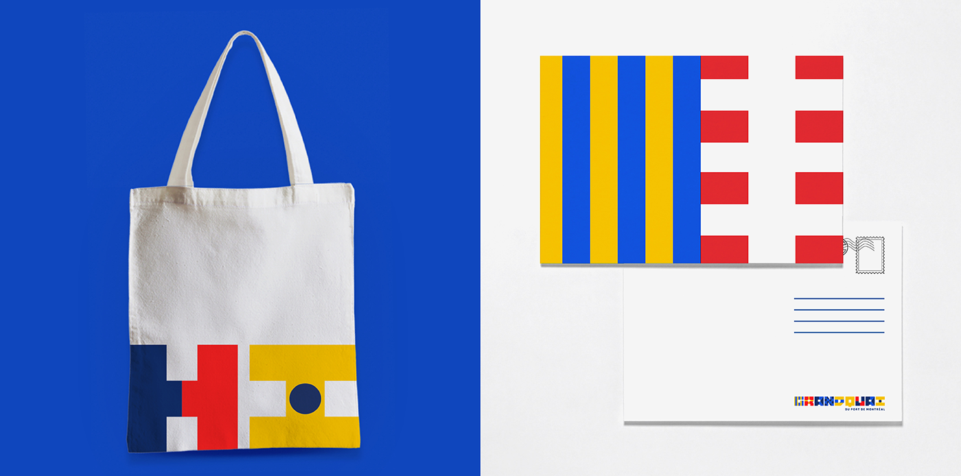
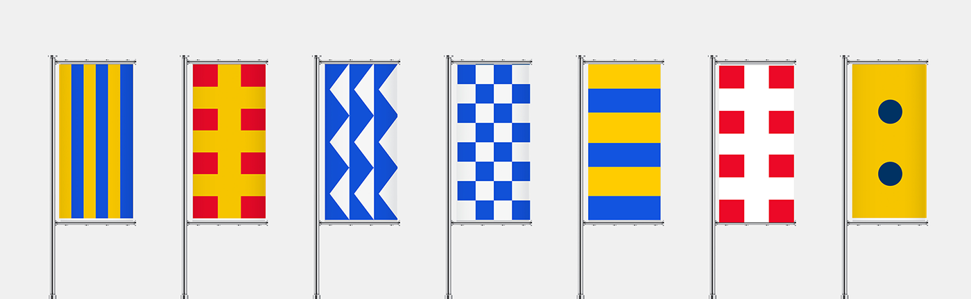
Colours that speak for themselves The maritime landscape of Montreal has always featured multicoloured flags, used as a visual code to communicate with sailors from a distance. Drawing inspiration from this vibrant language, we created a new identity for this unique point of entry into Montreal that’s attractive and welcoming, as well as a typography that’s doubly original. First, it anchors the Grand Quay’s identity platform firmly in its history, which makes it both strong and functional. Second, and even more interesting, each letter created represents the maritime flag it corresponds to, thereby transforming a coded system into a language shared between the Quay and the whole world.
Des couleurs qui parlent d’elles-mêmes Le paysage du Montréal maritime arbore depuis toujours des drapeaux multicolores, utilisés comme code visuel pour informer à distance les marins. En nous inspirant de ce langage coloré, nous avons créé une nouvelle identité attrayante et accueillante pour ce point d’entrée unique sur Montréal, puis avons conçu une typographie doublement originale.Premièrement, elle ancre la plateforme identitaire du Grand Quai dans son histoire pour la rendre aussi forte que fonctionnelle. Deuxièmement, et plus intéressant encore, chaque lettre créée représente le drapeau maritime auquel elle correspond, ce qui permet de transformer un système codé en un langage partagé entre le Quai et le monde entier.


Direction de création ➔ Richard Bélanger
Direction artistique ➔ David Théroux, Louis Chapdelaine, Simon Langlois
Conceptrice-rédactrice ➔ Mélanie Delisle
VP, branding ➔ Nathalie Houde
Directrice, lead d'affaires ➔ Eve-Marie Boutet
Chef de produits ➔ Fanny Laferrière, Andréanne Lessard
Conseillère à la production ➔ Colette Dumay
Retoucheur ➔ Daniel Cartier


